How to make a histogram in Excel ?
|
 Excel
|
Excel
|
5 months ago
|
8 Steps
Learn how to create visually appealing histograms in Excel to analyze and interpret numerical data. This document will walk you through the step-by-step process of organizing data, creating bins, and generating a histogram chart. Discover how to customize your histogram with different bin sizes, colors, and labels. By understanding the principles of histogram creation, you can gain valuable insights from your data and make informed decisions.
How to make a histogram in Excel ?
|
Excel
|
8 Steps

1
Open Excel and enter your data in a single column.
2
Select the "Data" you want to include in the histogram.
Click and drag to select all the cells containing your data values.

3
Click on the "Insert" tab in the Excel menubar.
The Insert tab contains various tools for adding charts, shapes, and more.

4
Click on the "Insert Statistic Chart" button (it looks like a histogram).
This option will provide you with different statistical chart types. Selecting this will open a dropdown menu.

5
Click on "Histogram" from the dropdown menu.
This action will automatically create a histogram based on your selected data.

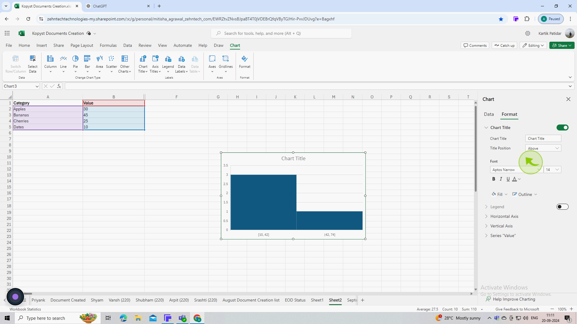
6
Double click on the "Horizontal" axis
In the Format Axis pane, you can adjust the bin width and the number of bins to better fit your data distribution.

7
Use the "Chart" tools that appear in the ribbon to customize your histogram.
You can change colors, add data labels, and adjust the chart title to make your histogram more informative.
8
Once satisfied with the appearance, save your "Excel" file.
You've successfully created a histogram in Excel!