How to make a scatter plot in Excel ?
|
 Excel
|
Excel
|
6 months ago
|
9 Steps
Learn how to create insightful scatter plots in Excel to visualize relationships between numerical data. This document will walk you through the step-by-step process of selecting your data, choosing the appropriate chart type, and customizing your plot to your specific needs. Discover how to add trendlines, labels, and formatting to enhance your data visualization. Whether you're analyzing scientific data, tracking business performance, or simply exploring trends, scatter plots are a powerful tool to uncover patterns and insights.
How to make a scatter plot in Excel ?
|
Excel
|
9 Steps

1
Open Excel and input your data.
Organize your data in two columns: one for X-axis values and one for Y-axis values. For example, column A can have X values and column B can have Y values.
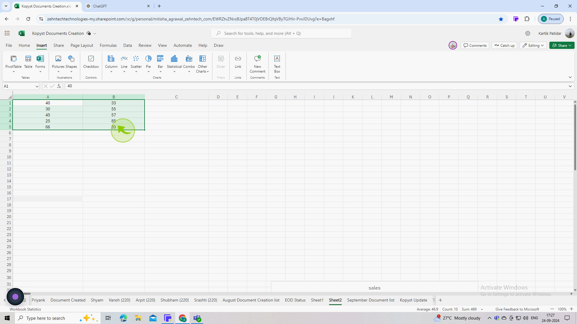
2
Select the data you want to plot.
Click and drag to select both columns of data (including headers if you have them) that you want to include in the scatter plot.
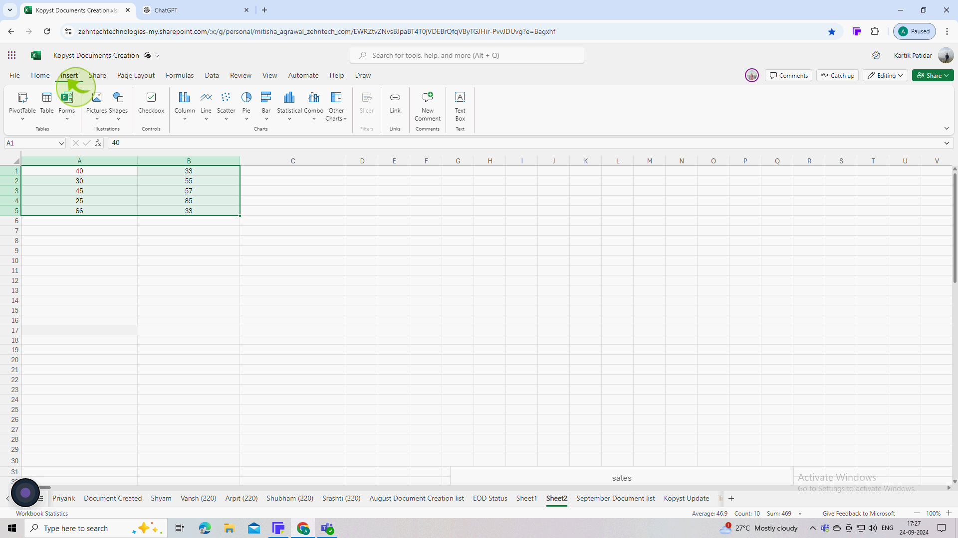
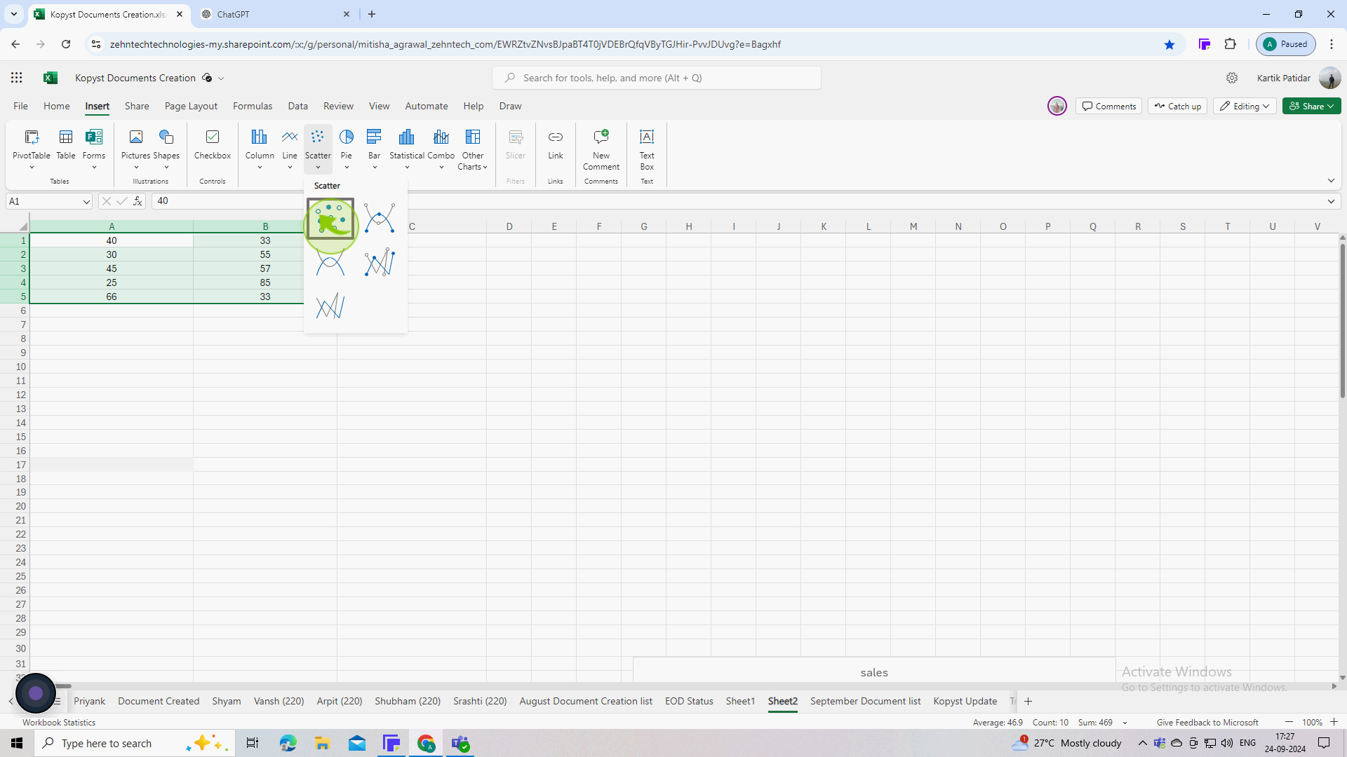
3
Go to the "Insert" tab on the ribbon.
Look for the Charts group in the Ribbon. You will see various chart options.
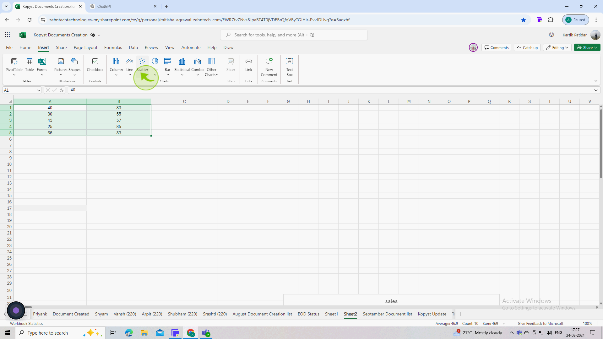
4
Click on the "Insert Scatter (X, Y) or Bubble Chart" icon.
This icon typically looks like a cluster of dots. A dropdown menu will appear with different scatter plot styles.
5
Choose the desired scatter plot type (e.g "Scatter" or "Scatter with Straight Lines").
The standard scatter plot is usually the first option, which shows only the points. Select it to create a basic scatter plot.
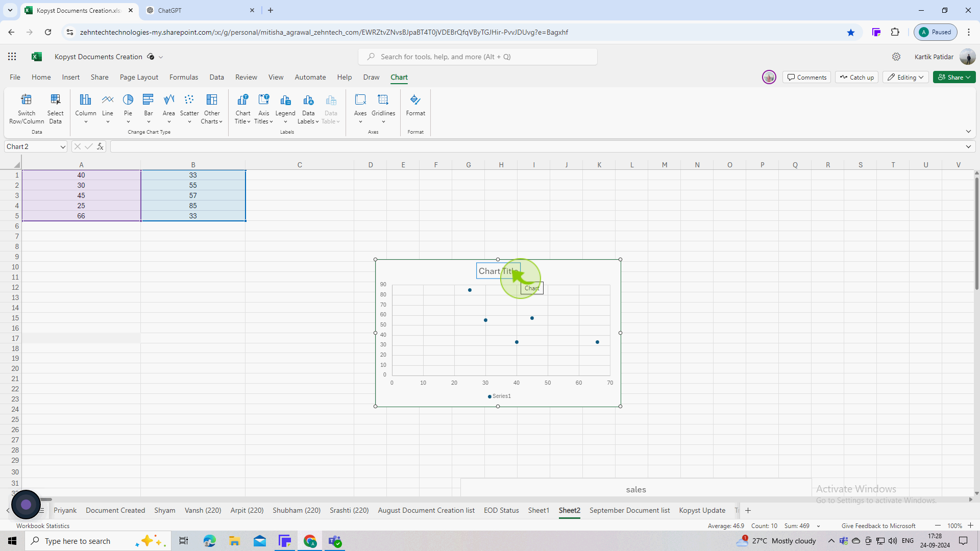
6
Click on the chart to activate the "Chart Tools".
This will show the "Data" and "Format" tabs in the Ribbon, allowing you to customize your chart’s appearance.
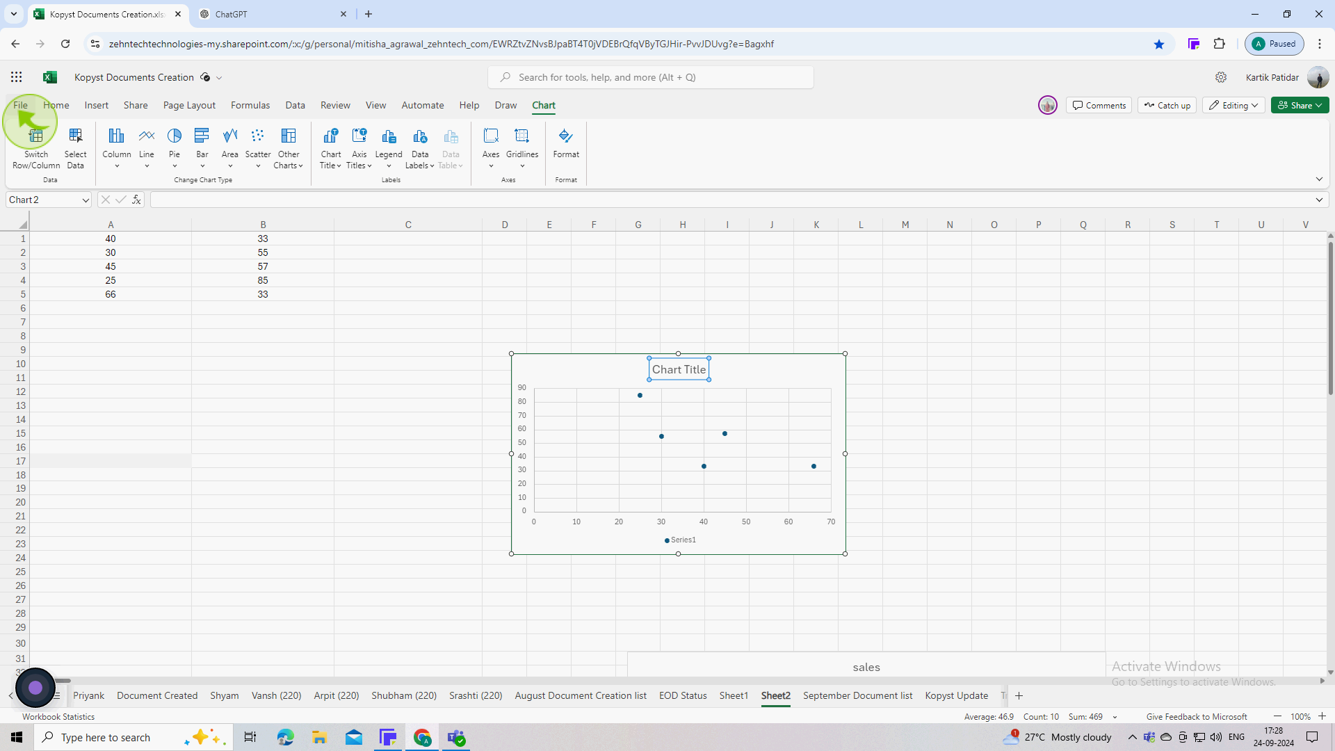
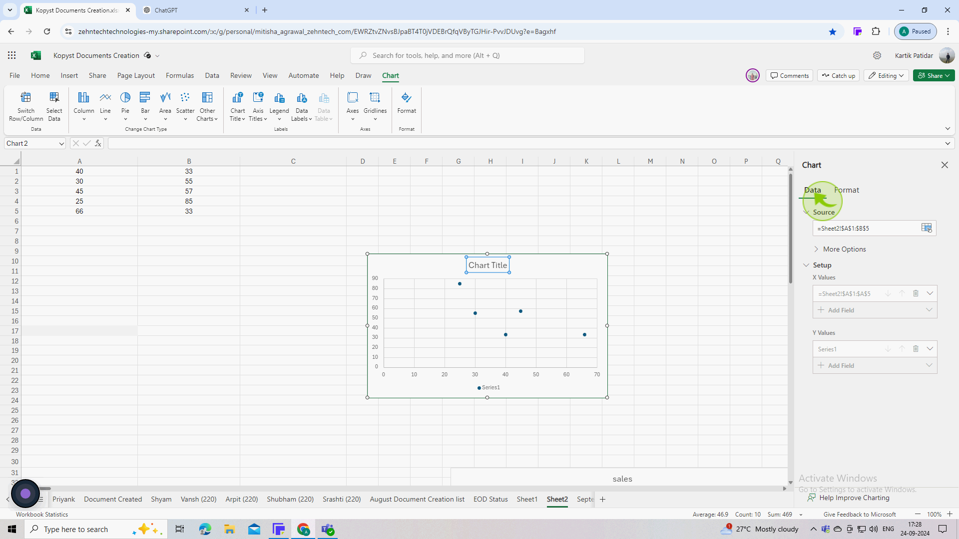
7
Click on the the "Data" tab.
You can add field, axis value and data labels to improve readability.
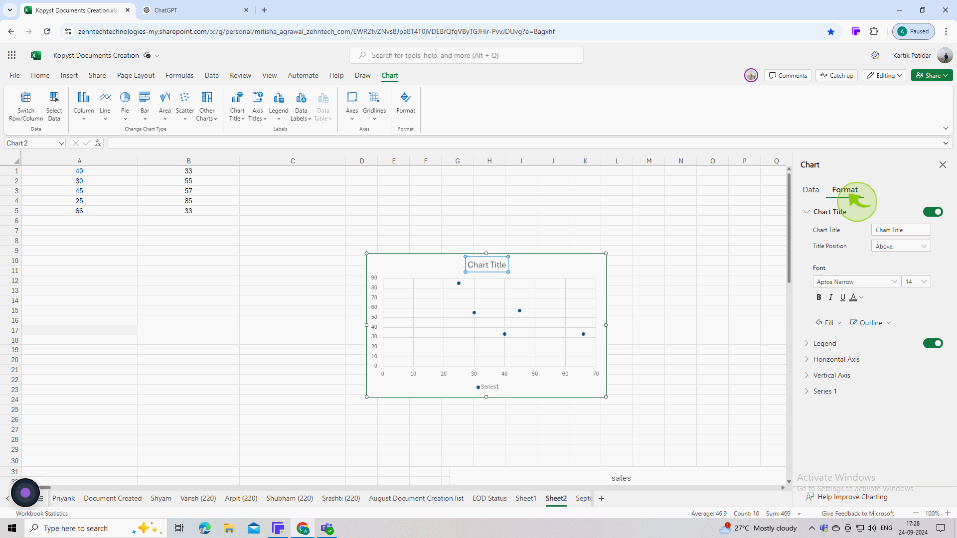
8
Click on the "Format" tab.
You can change colors, add markers, adjust the scale of axes, and apply various styles to enhance the visual appeal.
9
Save your Excel file.
Click on "File" > "Save As" to ensure your data and scatter plot are saved properly.