How to summarize data with charts & pivot tables in Google Sheets ?
|
 Google
|
Aug 28, 2024
|
7 Steps
Learn how to transform raw data into insightful visualizations using Google Sheets. This document will walk you through the process of creating pivot tables to summarize your data and then turning those summaries into easy-to-understand charts. You'll discover how to filter, sort, and group data to reveal trends and patterns that might otherwise go unnoticed. Whether you're a data analyst or simply someone looking to make sense of your spreadsheets, this guide will equip you with the skills to unlock the full potential of your data.
How to summarize data with charts & pivot tables in Google Sheets ?
|
 Google
|
7 Steps
1
Navigate to https://docs.google.com
2
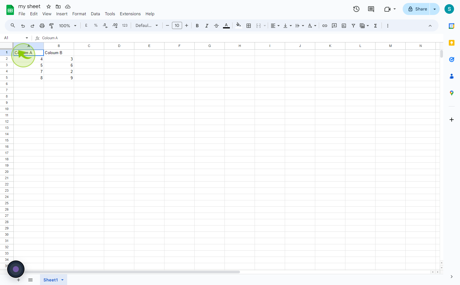
Click on the "Top" left corner of the data you'd like to include in your chart or pivot table.
3
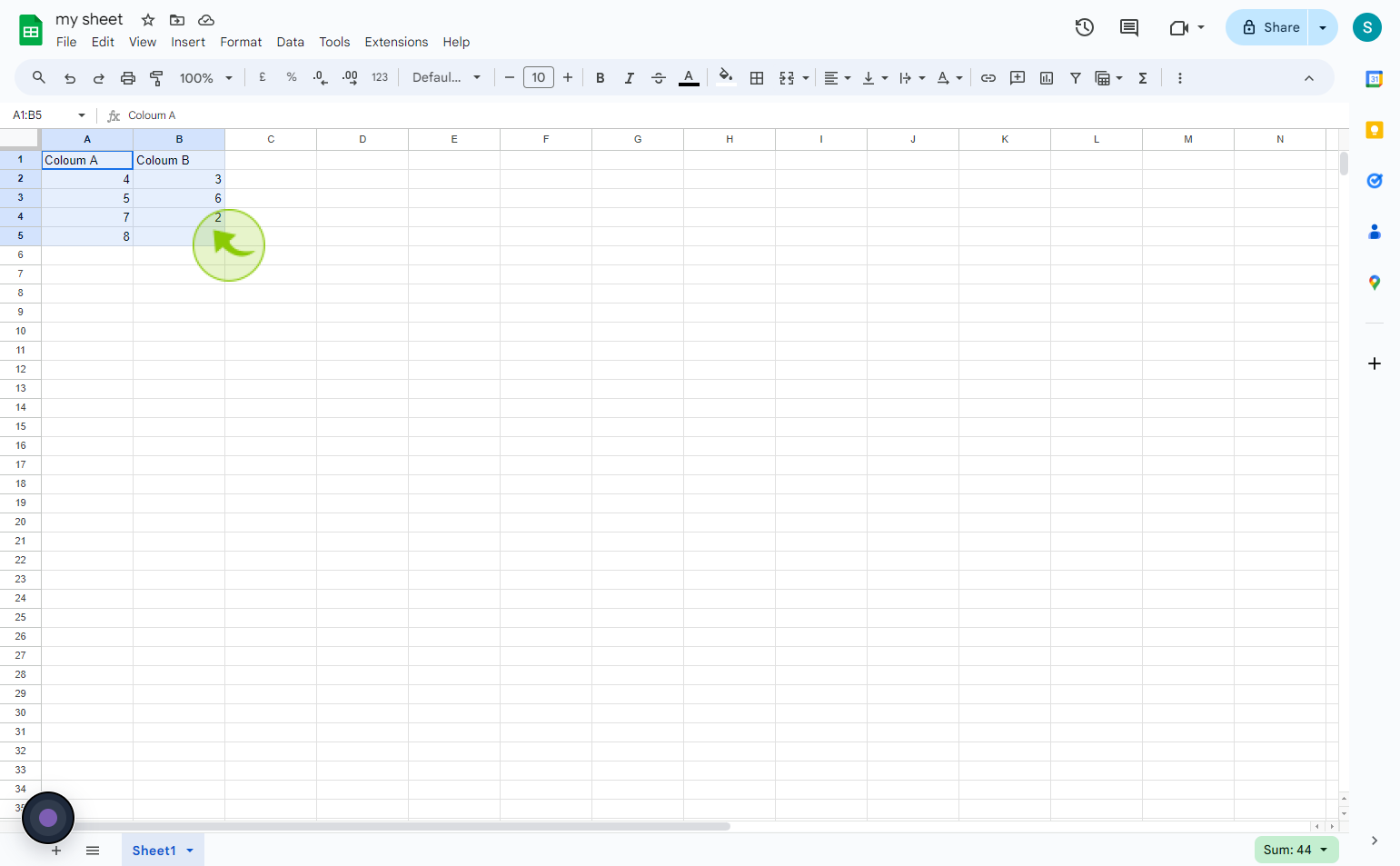
Hold shift and click on the bottom right corner of the "Data" you'd like to include in the chart or pivot table.
This will highlight the whole section of data.
4
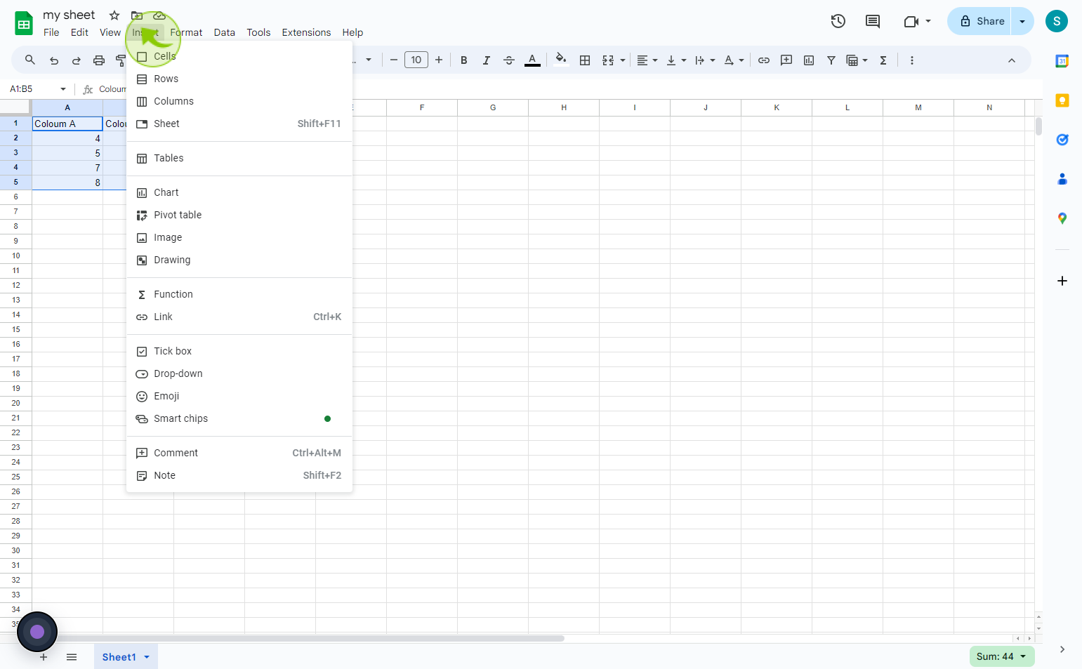
Click on the "Insert" tab.
5
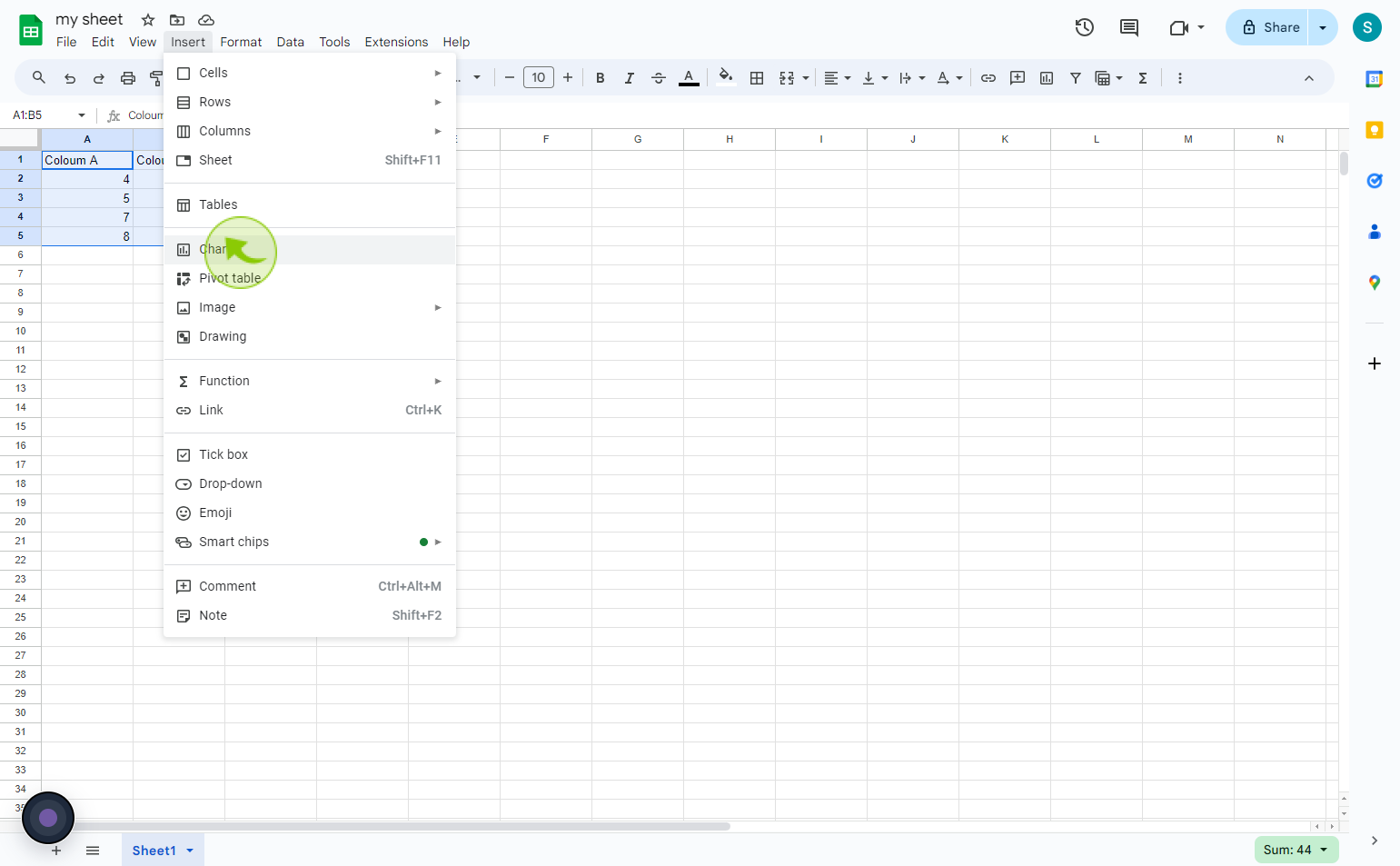
For a chart, click "Chart."
6
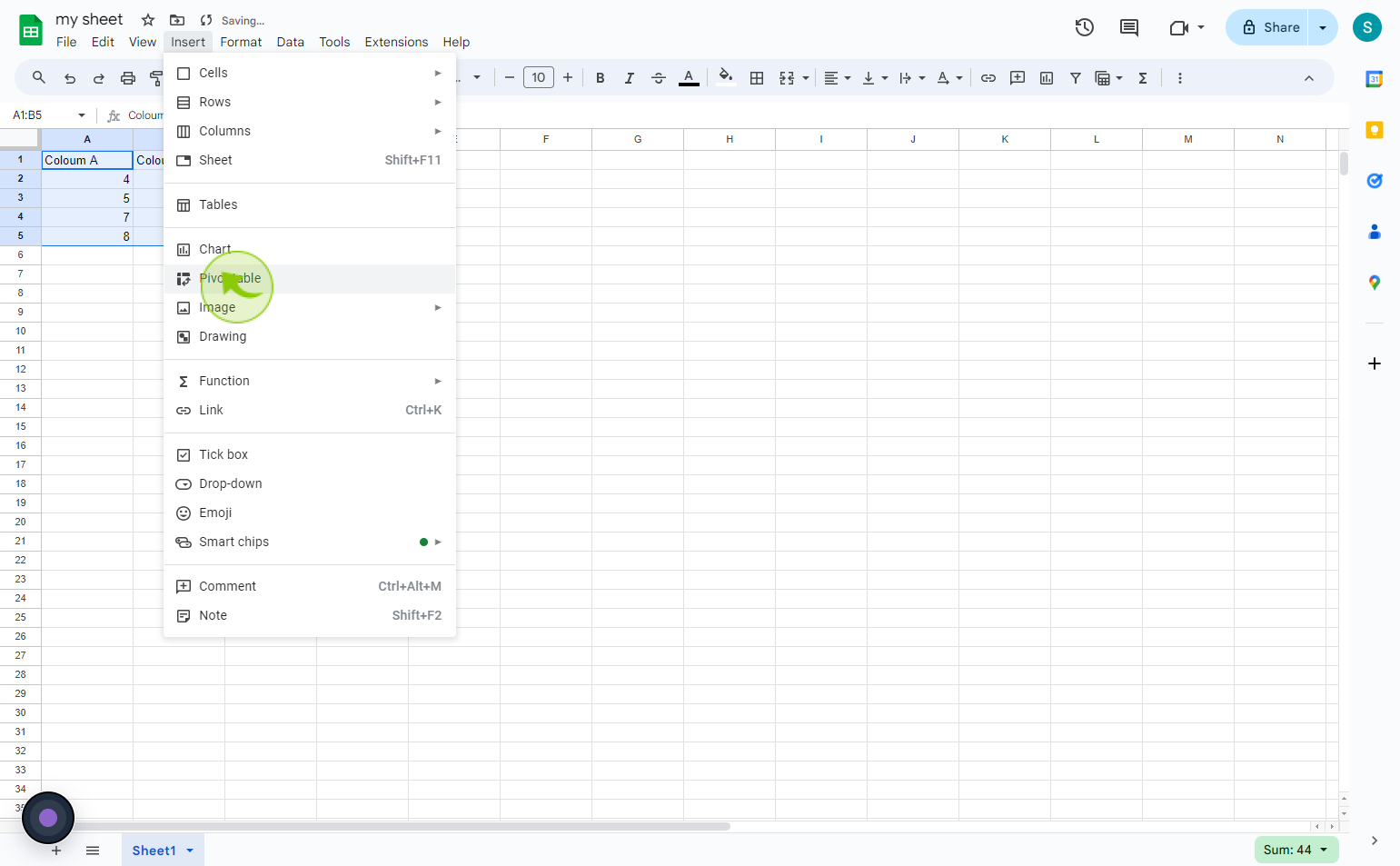
For a pivot table, click "Pivot Table."
7
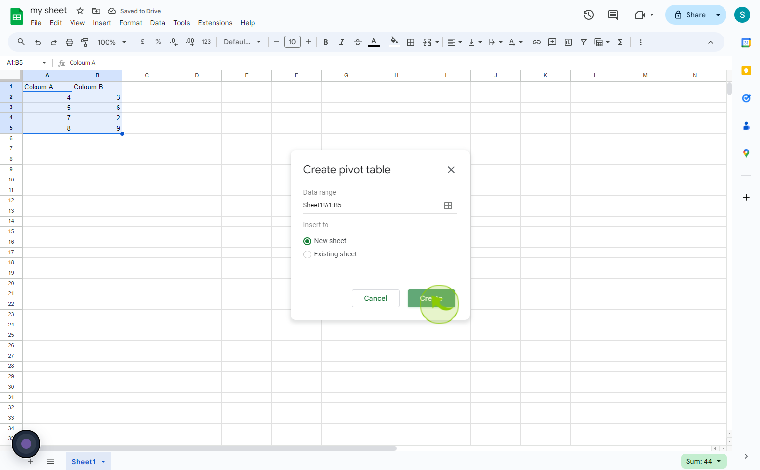
Select whether you'd like to pivot table in a new or existing sheet, then click "Create."
By following these steps you can summarize data with charts & pivot tables in google sheets
